
Sunday, August 01, 2010
Tomatoes and Peppers
Someone left some vegetables on the table in the studio where I teach watercolor classes so after my students left I did this quick watercolor. It's very Charles Reid-ish. It's very satisfying to sometimes work quickly and get something on paper. Charles Reid promotes contour drawing which is an excellent way to improve your drawing skills. He also teaches watercolor without doing a lot of layering (which I also agree with though I do a little more layering on my paintings.) The point of that is to get the values of your paint correct the first time so you don't disturb previous layers thereby keeping your watercolor fresh. You can do this by testing your colors on a scrap and comparing them to a value scale if you need to. I dampened my tomatoes and painted the reds with fresh pigment from the tube. I only went back with a second layer to put some shadows in. Colors used: Scarlet lake, Winsor red, Alizarin Crimson, Winsor Green, New Gamboge, Burnt Umber


Monday, July 26, 2010

Sunday, July 25, 2010
White Cat
This is a quickie watercolor I did to perk myself up after I got stuck on another art project this afternoon and was starting to despair. I do hate the emotional roller coaster that comes with being an artist!
4 x 4

4 x 4

Sunday, July 11, 2010
Susan - Finished Watercolor Portrait
Here is the finished watercolor of Susan, my sister. I thought I messed it up but a couple of days away from it and I realize it's not bad. And watercolor is forgiving. I think I lifted the mouth at least twice and it still looks pretty good to me.


Tuesday, July 06, 2010
"Susan" Watercolor Portrait Work in Progress
I'm using Arches 140 lb hot press paper to take advantage of the fun and looseness it creates. It's much easier to have a loose, splashy watercolor on hot press. Every time I use it I wonder why I don't paint on it more? 10 x 8


Monday, July 05, 2010
Showdown
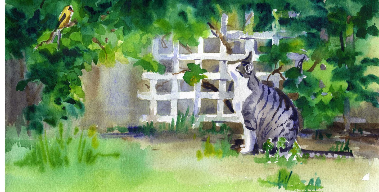 6 x 11 in.
Monday, June 28, 2010
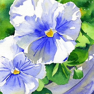
Blue Pansies Watercolor Demo
I have really enjoyed photographing and painting my pansies this year. This painting is one of the recent projects I've been teaching in my watercolor class. It measures 7 in. x 7 in.

I painted the background by moistening where I wanted the paint and using fresh pigment on my brush. Winsor Green (Yellow) and Cadmium Yellow. Make sure your paint brush is just damp so that when you apply the paint it will diffuse softly and give you soft edges. You don't have to always rinse your brush out before dipping into green or yellow.

The flowers were painted with ultramarine blue and the grayish areas in my photo are actually new gamboge added at the end of the ultramarine wash to just neutralize the blue a bit and give a glow near the edges. Paint each flower petal separately so you have some control You've got to pull the washes quickly and use enough pigment and water. Start near the center where the color is darker blue and draw it out to a lighter value towards the edge, adding pale new gamboge. (Try not to keep going over areas and stroking your paint on like you might with oils or acrylic, this will just stir it up and make a mess.) Remember, the wash will dry a couple of shades lighter and if your puddle of color isn't juicy enough and your brush isn't full of paint before you start the wash, especially with ultramarine blue, it will start to dry and you will get a "bloom". If you do, leave it alone. It's better to make it look like you did it on purpose. You might be able to lessen it with a second wash after the first one is dry. The flower centers are cadmium yellow.

The flower pot is painted with cobalt blue and touches of new gamboge. It looks kind of gray on my monitor but it's actually a dull greenish neutral.


I painted the background by moistening where I wanted the paint and using fresh pigment on my brush. Winsor Green (Yellow) and Cadmium Yellow. Make sure your paint brush is just damp so that when you apply the paint it will diffuse softly and give you soft edges. You don't have to always rinse your brush out before dipping into green or yellow.

The flowers were painted with ultramarine blue and the grayish areas in my photo are actually new gamboge added at the end of the ultramarine wash to just neutralize the blue a bit and give a glow near the edges. Paint each flower petal separately so you have some control You've got to pull the washes quickly and use enough pigment and water. Start near the center where the color is darker blue and draw it out to a lighter value towards the edge, adding pale new gamboge. (Try not to keep going over areas and stroking your paint on like you might with oils or acrylic, this will just stir it up and make a mess.) Remember, the wash will dry a couple of shades lighter and if your puddle of color isn't juicy enough and your brush isn't full of paint before you start the wash, especially with ultramarine blue, it will start to dry and you will get a "bloom". If you do, leave it alone. It's better to make it look like you did it on purpose. You might be able to lessen it with a second wash after the first one is dry. The flower centers are cadmium yellow.

The flower pot is painted with cobalt blue and touches of new gamboge. It looks kind of gray on my monitor but it's actually a dull greenish neutral.

I finished by wetting the petals and charging in some darker blue near the flower centers then while it's still wet (or you can wait for it to dry and rewet), I used a damp rigger brush and fresh ultramarine blue to paint in the streaks in the middle as well as a few dark nooks and crannies.
~
Here is an unsolicited watercolor brush recommendation. I am so excited to have discovered these Robert Simmons brushes at Michaels over the weekend! They are springy, hold just as much water as my sable and keep a nice sharp point and they are under $5! I don't know what they are called but they have short white handles and black ferrules. I think they are a natural and synthetic blend. Very nice to paint with!

Subscribe to:
Posts (Atom)
Drippy Daffodils
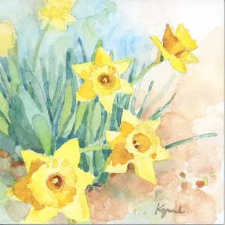
6 x 6 in. watercolor on Aquabord Daffodils are one of my favorite flowers and dozens of little clusters have been appearing in my yard s...
-
 I was determined to get at least one acrylic painting in this month and after two unsuccessful attempts, I got lucky today. I do prefer wate...
 -
 I ended up with three versions of "Entangled" this week. The first one I almost trashed but it ended up being a learning experi...
 -
 The theme for Illustration Friday this week was Sweater. Lots of fun you can have with that one. I originally thought it would be fun to hav...